A Comprehensive Guide to Responsive Web Design
Introduction to Responsive Web Design:
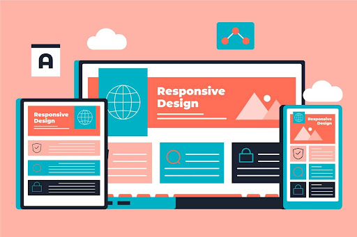
Welcome to the cornerstone of modern web development: Responsive Web Design (RWD). In today's digital age, where smartphones, tablets, laptops, and desktops reign supreme, RWD stands as a crucial approach to ensuring that websites not only look great but also function seamlessly across all devices and screen sizes. It's the art of crafting websites that adapt like chameleons, effortlessly adjusting their layout, content, and functionality to provide users with an optimal viewing and interaction experience, regardless of the device they're using. Responsive Web Design isn't just a trend; it's a necessity in a world where user engagement and accessibility are paramount. So, buckle up as we embark on a journey to unravel the mysteries and master the intricacies of Responsive Web Design.
Understanding the Benefits:
Understanding the benefits of Responsive Web Design (RWD) is paramount in today's dynamic digital landscape. RWD ensures that websites deliver a seamless user experience across a myriad of devices, from smartphones to tablets and desktops. By embracing RWD, businesses can enhance their online presence and cater to a diverse audience, regardless of the device they use to access the website. For companies like My Staffing, operating in the realm of IT services and positioned for the future of Android, RWD offers the assurance that their services are presented flawlessly across various Android devices, solidifying their digital footprint.
Furthermore, RWD fosters consistency in branding and user interface, instilling trust and credibility among visitors. Ultimately, the adoption of Responsive Web Design not only enhances user satisfaction but also contributes to improved engagement, conversion rates, and overall success in the competitive digital landscape.

Exploring the Core Principles:
Exploring the core principles of Responsive Web Design (RWD) unveils the fundamental pillars upon which adaptable and user-friendly websites are built. These principles serve as a guiding light for businesses navigating the ever-evolving digital landscape, especially pertinent in the context of the future Android landscape and businesses offering IT services. RWD entails creating websites that seamlessly adjust to diverse screen sizes and devices, ensuring a consistent user experience across platforms.
By adhering to these principles, businesses transcend the limitations imposed by varying device dimensions and resolutions, thereby bolstering their credibility and enhancing user satisfaction. The core principles of RWD underscore the importance of flexibility, accessibility, and user-centric design, empowering businesses to thrive in an era characterized by technological innovation and rapid digital transformation.

Crafting Your Strategy:
Crafting a robust strategy for Responsive Web Design (RWD) is essential for businesses, particularly those deeply ingrained in the Android ecosystem and engaged in app development frameworks. A strategic approach aligns web design efforts with broader business goals, ensuring that websites effectively serve their intended purpose and cater to the diverse needs of users across different devices. For businesses like IT Solutions Group, specializing in Android app development and comprehensive IT services, a well-defined RWD strategy involves prioritizing optimization for Android devices while also considering other platforms.
This strategy encompasses aspects such as user experience optimization, content adaptation, and performance enhancement to create a cohesive and seamless web experience. By strategically planning for RWD, businesses can maximize their online presence, engage their target audience effectively, and stay ahead of the competition in the ever-evolving digital landscape.

Designing for Diversity:
Designing for diversity in the realm of Responsive Web Design (RWD) is essential to ensure optimal user experiences across a wide range of devices, including Android tablets. This approach involves adopting responsive design principles that accommodate different screen sizes, orientations, and resolutions. For businesses offering services like in-app solutions and social media app development, it's crucial to create interfaces that remain user-friendly and visually appealing on both small and large tablet screens. By carefully considering layout, navigation, and content placement, businesses can engage users seamlessly, regardless of the device they use, thereby enhancing accessibility and user satisfaction in an increasingly diverse digital landscape.

Building with HTML and CSS:
Building with HTML and CSS forms the core of Responsive Web Design (RWD), allowing for the creation of adaptable layouts that adjust seamlessly to diverse devices. HTML structures website content, while CSS controls its presentation, including layout and style. Responsive design techniques within HTML and CSS facilitate the creation of flexible grids and fluid layouts, ensuring optimal functionality and visual appeal across platforms, including Android development.

Optimizing Typography and Images:
Optimizing typography and images is essential in Responsive Web Design (RWD) to ensure a seamless user experience across various devices. Typography must be adaptable, ensuring that content remains legible and visually appealing regardless of screen size or resolution. By employing techniques such as fluid typography and scalable fonts, businesses can maintain readability and consistency across different platforms, including Android devices. Similarly, optimizing images involves resizing, compressing, and using responsive image techniques to ensure swift loading times and minimal impact on page performance. This attention to detail enhances user engagement and satisfaction, contributing to the overall success of the website in today's competitive digital landscape.

Leveraging Media Queries:
Leveraging media queries is integral to Responsive Web Design (RWD), enabling dynamic adjustments in layout, typography, and images based on device characteristics. By employing media queries, businesses ensure that websites and applications maintain optimal functionality and aesthetics across various devices and orientations, including Android. For instance, when creating an Android app development framework, media queries enable seamless scaling and positioning of elements, ensuring a consistent user experience. This strategic use of media queries enhances accessibility and engagement, reinforcing the effectiveness of RWD in catering to diverse audiences in today's digital landscape.

Prioritizing Performance:
Prioritizing performance in Responsive Web Design (RWD) is crucial for delivering a seamless user experience across devices. By strategically optimizing elements such as images, scripts, and code, businesses ensure that websites load swiftly and efficiently, particularly on platforms like Android. This emphasis on performance not only enhances user satisfaction but also contributes to improved engagement and conversion rates. In today's fast-paced digital landscape, where users expect instant access to content, prioritizing performance is essential for maintaining a competitive edge and achieving success online.

Testing and Debugging:
Testing and debugging are essential phases in Responsive Web Design (RWD) to ensure the flawless functionality of websites across various devices, including Android. Rigorous testing involves evaluating websites across different screen sizes, resolutions, and browsers to identify any layout discrepancies, functionality issues, or visual glitches. Effective debugging allows businesses to rectify these issues promptly, ensuring a seamless user experience. By conducting thorough testing and debugging processes, businesses uphold their commitment to delivering high-quality, responsive websites that cater to the unique needs of users, ultimately enhancing user satisfaction and bolstering their online presence.

Embracing Best Practices:
Embracing best practices in Responsive Web Design (RWD) is crucial for creating websites that excel across various devices, including Android. This involves adopting a mobile-first approach to prioritize design for smaller screens and then scaling up for larger ones. Flexible grids and media queries are employed to ensure content adapts gracefully to different screen sizes and orientations. By optimizing website performance through efficient code and image optimization, businesses can enhance user experience and engagement. Embracing best practices not only ensures a seamless user experience but also reinforces the website's credibility and competitiveness in today's digital landscape.

Exploring Tools and Frameworks:
Exploring tools and frameworks is essential in Responsive Web Design (RWD) to streamline the development process and ensure consistent functionality across various devices, including Android. Utilizing frameworks like Bootstrap, Foundation, or Materialize provides pre-built components and responsive grids that simplify design implementation. These tools offer CSS frameworks and JavaScript components that facilitate the creation of adaptable layouts and interactive elements.
By leveraging these resources, businesses can expedite the development of responsive websites, enhancing efficiency and maintaining a cohesive user experience across platforms. Additionally, exploring tools specific to Android development, such as Android Studio and Flutter, allows businesses to optimize their websites for the Android platform, further enhancing accessibility and engagement for Android users.

Looking to the Future:
Looking to the future, Responsive Web Design (RWD) remains essential for businesses to adapt to emerging trends and technologies, ensuring seamless user experiences across devices like Android. As advancements in AI, AR, and IoT reshape the digital landscape, RWD will continue to play a pivotal role in delivering exceptional user experiences and maintaining competitiveness.

Conclusion:
In conclusion, mastering Responsive Web Design (RWD) is key to thriving in today's dynamic digital landscape. By implementing the principles, best practices, and tools outlined in this guide, businesses can create websites that adapt seamlessly to various devices, including Android, thus enhancing user engagement and driving success online. As you embark on your journey to harness the power of RWD, remember that LionProDev stands ready to support you every step of the way. With our commitment to pushing boundaries and creating websites that combine utility and delight, LionProDev can help you unlock the full potential of RWD and achieve your online goals. Explore our services at LionProDev to start your journey to digital success today.